


The Daily Dish
October 12, 2018
Fun With Charts
Eakinomics: Fun With Charts
The gripping news story (for those dedicated watchers of CNBC or Fox Business) has been the stock market gyrations of the past several days. If you listen continuously you will arrive at explanations that add up to explaining well over 100 percent of the market moves – or explain nothing at all.
As I have noted on numerous occasions, I pay precious little attention to the equity markets in assessing the near-term health of the economy. The chart below shows why.
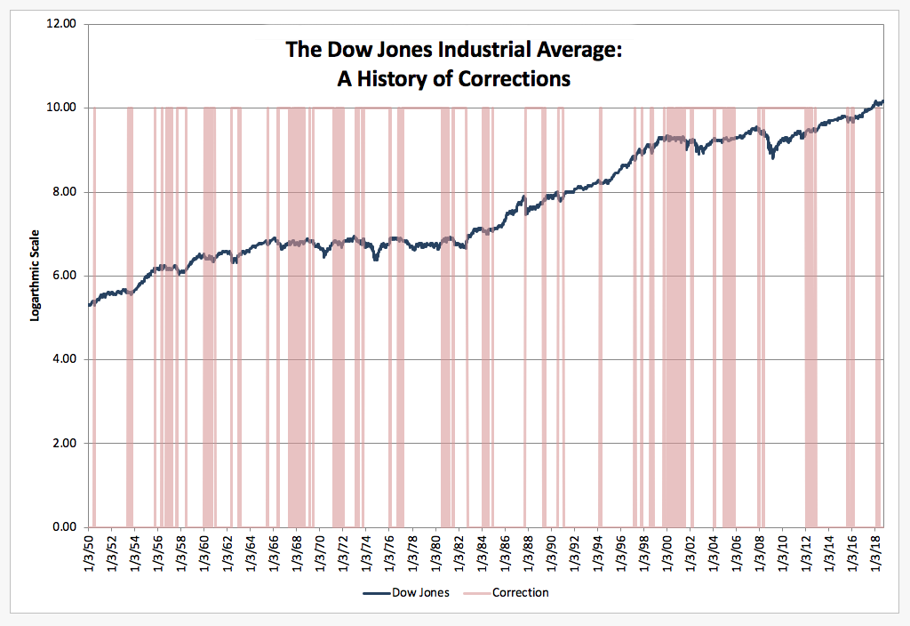
The dark line is the Dow Jones Industrial Average (DJIA, in natural logarithms) since January 1950, while the shaded areas are those periods in which the DJIA is 10 percent (or more) below the previous high – the popular definition of stock market “correction.” The moral is clear: Corrections are about as frequent as the Cleveland Browns’ losses. And since there have not been nearly so many recessions, they are about as meaningful in predicting the near-term outlook for the economy.
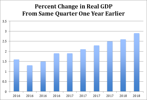
Instead, I prefer to focus on growth in the real economy, as typically measured by gross domestic product (GDP). In contrast to the volatile picture painted by equity markets (and their coverage), GDP growth (see below) has steadily risen over the past two years to nearly 3 percent (year over year).
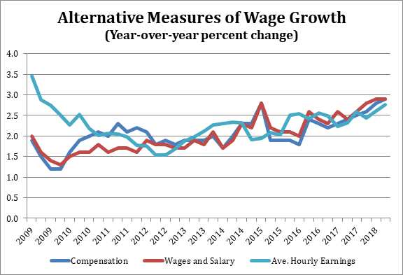
An issue that arises, however, is whether this growth is translating into a better living for the average American worker. The Employment Cost Index (ECI, see below) measures growth in both total compensation (dark blue line) and wage and salary growth (red line) (again, year over year). As one can see, measured either way wage growth is also nearing 3 percent and is up by a third in the past two years.
The ECI controls for the fact that the average worker changes over time. As the boomers retire the average worker will be younger and less skilled, for example. In contrast, the monthly average hourly earnings (light blue line) released with the jobs report has no way to do so. As a result, when times are bad (and the less experienced and lower skilled are out of work) it tends to overestimate wage growth (see, e.g., 2009-2011), while more recently the opposite is true.
The bottom line is simple. Take a deep breath. Turn off the market commentators (unless it’s me). And evaluate the state of affairs quarterly and no more frequently.
Fact of the Day
Oil prices are currently 34 percent above what the federal Energy Information Administration projected in January.