


The Daily Dish
April 26, 2018
Taking the Temperature of the Housing Market
Eakinomics: Taking the Temperature of the Housing Market
I’ve noted elsewhere that Congress has lost a decade in much-needed progress toward reforming housing finance. Indeed, much of what has happened has gone in the wrong direction. The Federal Housing Administration (FHA) has regularly tried to cut premiums to lure more risky buyers into the market – despite the fact that it is not adequately capitalized. The Credit Risk Transfer programs were supposed to move default risk away from the taxpayer and toward voluntarily supplied private capital, but have disappointed at best. And Fannie Mae and Freddie Mac are backstopping increasingly risky buyers (at odds with the wishes of Congress) and moving into direct lending itself.
This is bad news, but it wouldn’t be as troubling if housing markets were remaining sensibly priced. But concern is rising on this front as well. The chart below shows the S&P CoreLogic Case-Shiller (“Case-Shiller”) index of home prices for 20 leading cities.
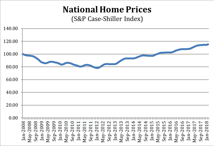
What tale do the data tell? The bust-boom of the Great Recession jumps right out, with home prices up nearly 50 percent since bottoming out in 2012 – an annual rate of over 6.5 percent. That’s a pretty hefty increase and raises some modest alarm bells about the stability of the housing market.
But is this really 2007-2008 all over again? Who knows, but there is another eerie resemblance: the regional pattern of house price increases. Prior to the financial crisis, “sandy states” – coastal states in the west and southeast – saw the large run-up in prices followed by a big decline. The rest of the country did not experience this pattern. Instead, it suffered from prolonged poor economic performance that tempted individuals to use second mortgages to access housing equity.
The chart below breaks out San Francisco and Cleveland.
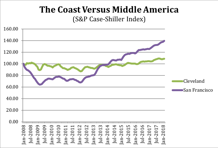
San Francisco shows the bust followed by a new boom – house prices up 117 percent (over 9 percent annually). The San Francisco data could easily be replaced by that of Seattle, San Diego, Los Angeles, Phoenix, Las Vegas, Tampa, Atlanta, or other cities without changing the picture. Cleveland, in contrast, shows a flat-lined housing market that reflects a flat-lined economy.
The latter is a reminder of the fundamental need for better growth policies, while the former should be a warning bell against ever-easier federal housing policies.
Fact of the Day
Roughly 25 percent of annual spending on highways and mass transit comes from the federal government.