


Infographic
April 11, 2018
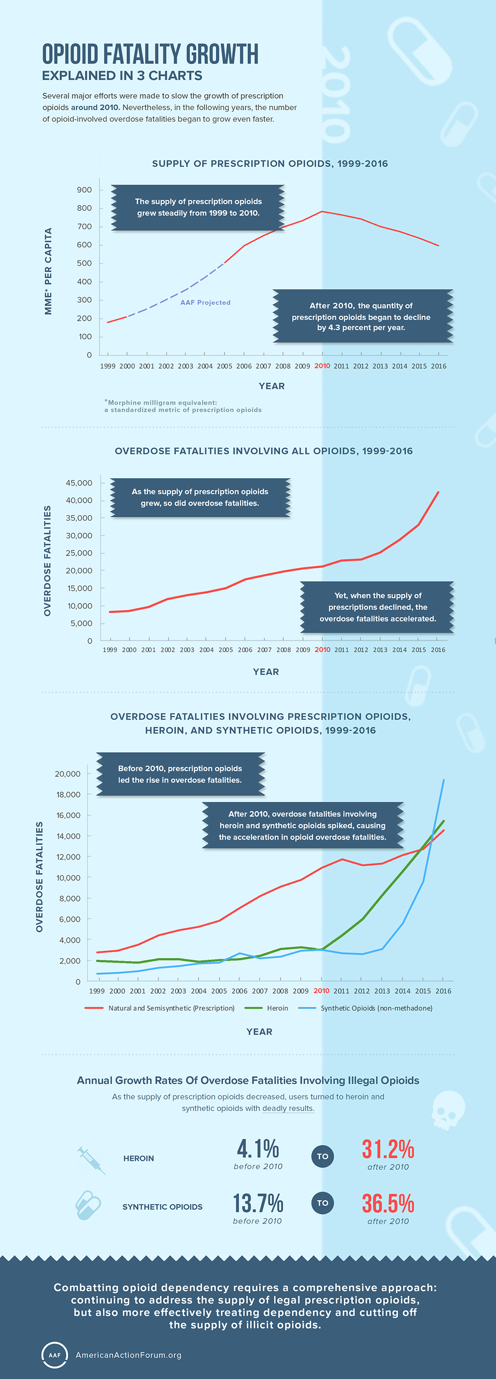
Opioid Fatality Growth Explained In 3 Charts
Infographic
April 11, 2018
Ben Gitis
The American Action Forum is a 21st century center-right policy institute providing actionable research and analysis to solve America’s most pressing policy challenges.
July 2025
+0.2%
+2.7%
Measures the change in prices of all goods and services purchased for consumption by urban households.
July 2025
+0.3%
+3.1%
Consumer Price Index excluding food and energy.
July 2025
+0.3%
+2.9%
A measure of prices paid for goods and services excluding food and energy; the Federal Reserve’s preferred measure of inflation.
July 2025
+0.9%
+3.3%
Measures the change in selling prices received by domestic producers of goods and services.
Week ending August 30, 2025
237,000
+8,000
231,000
Weekly unemployment insurance claims reported by each state’s unemployment insurance program offices.
August 2025
52.0
+1.9
A level above 50 indicates expansion
August 2025
48.7
+0.7
A level above 50 indicates expansion
August 2025
58.2
-3.5
The core questions cover three broad areas of consumer sentiment: personal finances, business conditions, and buying conditions.
August 2025
+54,000
Measures change in private-sector employment using ADP payroll data covering more than half a million companies with more than 25 million employees.
July 2025
$76.4 B
+1.1%
+4.5%
A new order is a communication of an intention to buy for immediate or future delivery.
July 2025
1,428,000
+5.2%
+12.9%
Privately owned housing starts; seasonally adjusted at an annual rate.