


Research
November 23, 2016
Infrastructure Spending Trends
Summary
- The overall level of infrastructure spending by the public and private sector has increased since 1956.
- The U.S. would have to increase public infrastructure spending by $30 billion to get back to the 2.6 percent average share of GDP for the period between 1956 and 2014.
- The U.S. would have to increase federal infrastructure spending by $33.4 billion to get back to the 3.7 percent average share of federal spending for the same period.
- Real fixed capital per worker has increased 50 percent between 1956 and 2015.
- As of 2014, the U.S. spends more on infrastructure operation and maintenance than new capital by $54.5 billion, or 30 percent.
- The decline in U.S. infrastructure can’t be explained by a decrease in spending. The likely explanations are that the infrastructure needs have changed or the quality of infrastructure spending has weakened.
Introduction
American infrastructure has recently come under heavy criticism. The American Society of Civil Engineers gave the state of U.S. infrastructure a D+ grade in 2013 and estimates $3.6 trillion in investment is needed by 2020 to alleviate infrastructure shortcomings. Both presidential candidates proposed infrastructure spending to address this investment gap. Hillary Clinton proposed spending $275 billion over a 5-year period to address infrastructure needs, including $25 billion to create an infrastructure bank. President-elect Donald Trump proposed spending $1 trillion on public infrastructure. (AAF released research evaluating the presidential candidates’ proposal with emphasis on the need for an efficient funding strategy.)
This paper confronts perceived infrastructure failings with the data on public and private real infrastructure spending over recent decades. Interestingly, the data do not immediately point to a specific explanation for the poor perceived state of infrastructure. Accordingly, we turn to some possibilities that might explain the gap, such as changes in infrastructure needs and the quality of infrastructure spending.
Public Sector Infrastructure Spending Trends
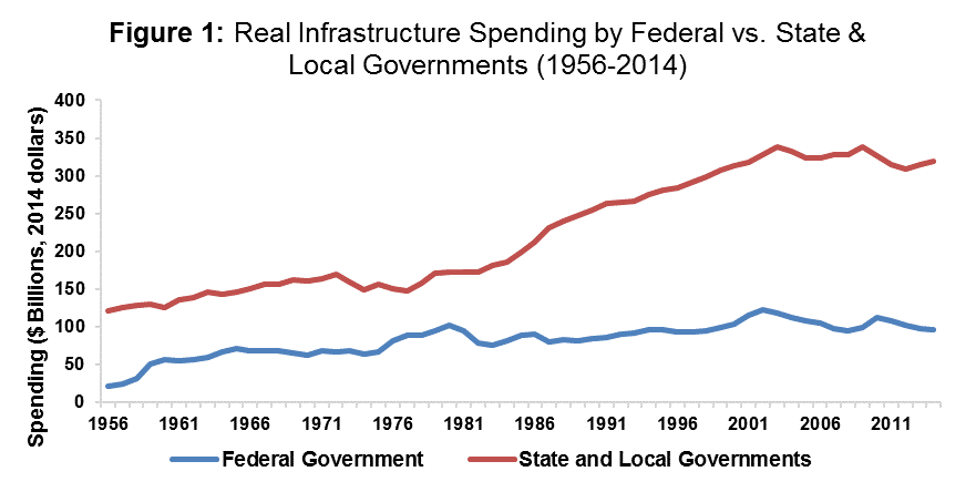
Figure 1 uses CBO data[1] from 1956 to 2014 to display the level of real (inflation-adjusted) public spending for transportation and water infrastructure. The data reveal that total infrastructure spending has been on the rise over the past six decades. Although state and local government spending grew more substantially, the federal government also increased its real level of spending.
Figures 2 and 3 use CBO data[2] and present the transportation and water infrastructure spending as a share of GDP and federal spending, respectively.
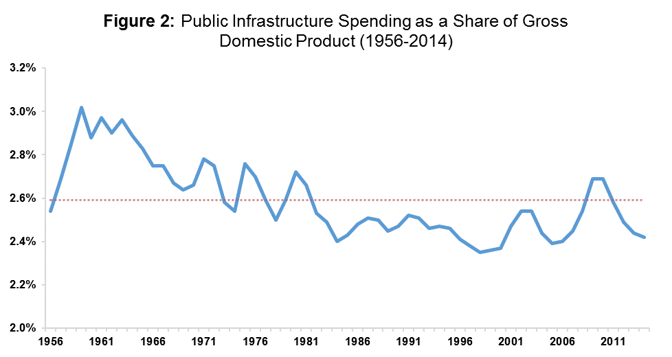
For the years between 1956 and 2014 in Figure 2, infrastructure spending as a share of GDP does not deviate greatly from its average of 2.6 percent. Note, however, that the 2014 infrastructure spending share is below the average, that the spending share has fallen behind since 2011, and that in the absence of the American Recovery and Reinvestment Act (ARRA, or “stimulus”) the share has been below average for 35 years. The 2014 infrastructure spending share was 2.4 percent and would need an additional $30 billion to get back to the 2.6 percent average. This $30 billion gap from the average would be easily covered by either presidential candidates’ proposal.

Figure 3 shows the share of infrastructure spending in overall federal outlays, and tells a story similar to that in Figure 2. That is, infrastructure spending has slipped in importance as a priority of the federal government. The 2014 infrastructure share of federal spending was 1 percentage point lower than the 3.7 percent average. To jump from 2.7 to the 3.7 percent average, infrastructure spending would have to increase by $33.4 billion dollars. This number is in line with the previous figure’s estimate and both candidates’ proposals would be sufficient to cover this shortfall.
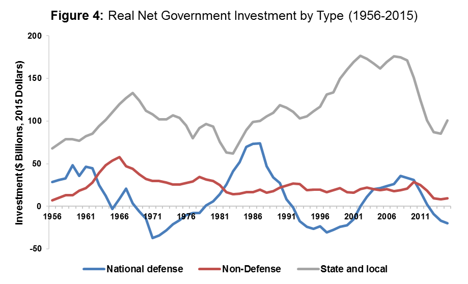
Another possibility is that the reduced focus on infrastructure spending has permitted the total amount of infrastructure capital to decline. Figure 4 looks at the net investment in infrastructure – that is investment net of depreciation of existing capital – using Bureau of Economic Analysis (BEA) inflation-adjusted data.[3] The real net investment data indicates that government investment in non-defense projects has remained positive, with capital stock growing, for the past sixty years. The net non-defense spending from all levels of government totaled $110 billion in 2015, which is up $16 billion from 2014. Although the national, state and local governments saw a decline since 2009, those investments are still sufficient to offset depreciation which means infrastructure capital is expanding.
Private Sector Infrastructure Trends
Focusing on public sector capital may actually miss the big picture in infrastructure capital. Figure 5 demonstrates increasing interest in private sector infrastructure involvement by using inflation-adjusted BEA data[4] from 1956 to 2014 to show the real levels of private investment for the three available infrastructure groups: transportation and water, power, and communication.
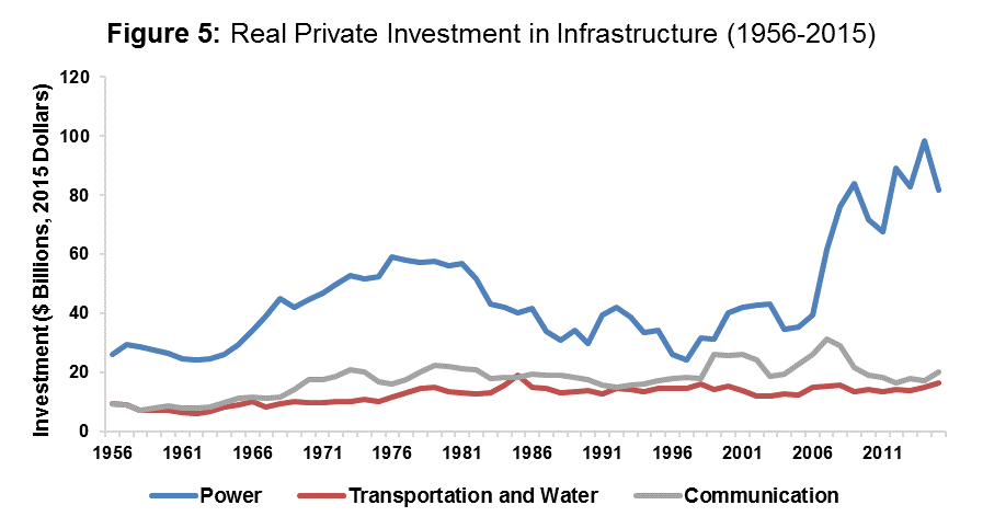
The data indicate that the private sector invested substantially in power infrastructure over the last six decades. Since 1956, private sector investment in power increased by $55.8 billion, or 213 percent. Transportation and water infrastructure saw moderate increases between 1956 and 2015 with $6.9 billion in additional spending, a 72 percent increase. Furthermore, communication infrastructure spending experienced some spikes in growth since 1956, growing by $10.7 billion, or 112 percent. The peaks in 1999 and 2007 can be attributed to the telecommunications act of 1996 and the expansion in mobile and wireless service, respectively.
These figures show that infrastructure spending in both the public and private sectors have increased or stayed the same. Despite these findings, the current state of U.S. infrastructure is in poor condition. This begs the question, why is this level of spending not working?
Growing Infrastructure Needs
One possible explanation is that more infrastructure spending is needed today than in the past. This is difficult to quantify because of the shared nature of infrastructure; it does not necessarily get “used up” as more people benefit from it. However, as the usage increases, there is greater congestion on roadways and on other transportation systems which might increase infrastructure spending needs. Figure 6 uses inflation adjusted BEA[5] and Current Employment Statistics[6] from the BLS to formulate inflation-adjusted fixed capital per U.S. worker to investigate this claim.
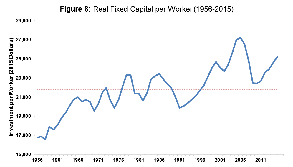
Figure 6 shows that the real fixed capital per worker increased 50 percent between 1956 and 2015. There was a sharp drop off caused by the great recession but the U.S. has mostly recovered from that. The 2015 real net domestic investment per worker is about $3,400 more than the period’s average of $21,800. Figure 6 demonstrates that the U.S. would likely have better infrastructure in general today if the infrastructure needs had remained constant since 1956. This indicates that constant or increased spending has not kept up with growing infrastructure needs.
Spending by Infrastructure Type
Another possibility is that the top-line outlay data masks shifts in the composition of infrastructure spending. To show how the allocation of public infrastructure spending has changed, the following figures use CBO data[7] to dissect infrastructure spending into 6 subsections: highways, mass transit and rail, aviation, water transportation, water resources, and water utilities.
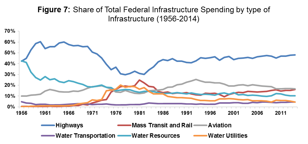
Figure 7 shows that highway spending has consistently received the most federal spending between 1956 and 2014 and highways make up 48.1 percent of 2014 federal infrastructure spending. Water resources experienced a substantial decline of 32 percentage points between 1956 and 2014. Water resources spending slowly transitioned from purchasing new capital to maintaining and operating the already existing capital. Between 1956 and 1970, mass transit and rail was not a significant portion of federal infrastructure spending but as of 2014 makes up 16.1 percent of total federal infrastructure spending.
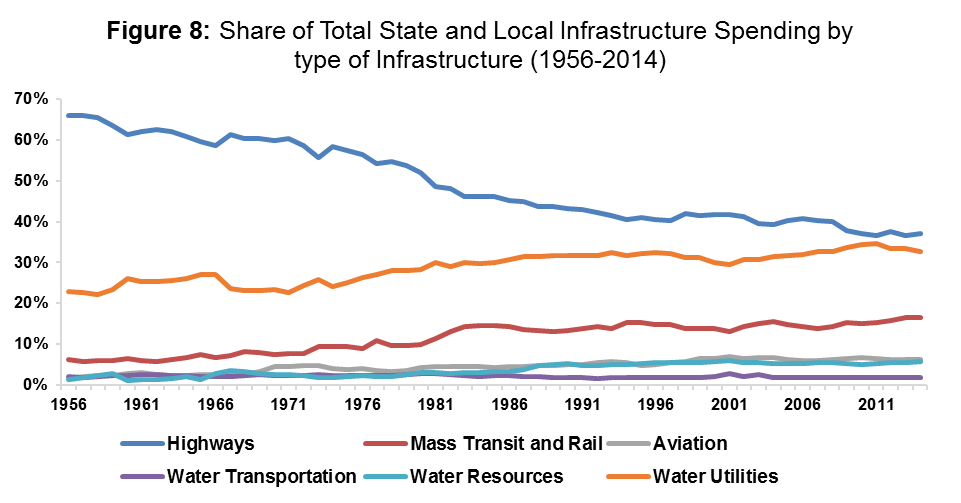
Figure 8 reveals that state and local infrastructure spending allocation has undergone substantial changes. Highways, once again, are the majority portion but that lead has declined since 1956. Water utilities along with mass transit and rail saw considerable increases in the share of total spending. Water utilities spending increased as greater importance was placed on improving water quality. Mass transit and rail spending increased with the help of federally subsidized policies beginning with the Urban Mass Transportation Act of 1964.
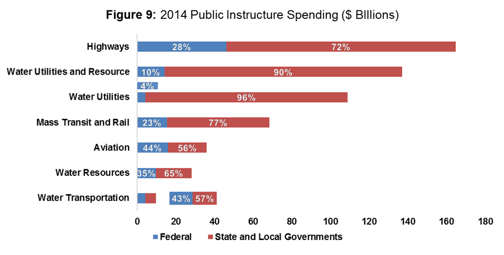
Figure 9 provides a 2014 snapshot of the total spending for each type of infrastructure by level of government using CBO data.[8] Figure 9 supports the trend of the previous figures—highways require the most resources and state and local governments make the largest contributions. This chart also reveals the low share, 4 percent, of federal spending on water utilities. Since the benefits and concerns of water utilities are specific to local regions, it is not surprising that the bulk of the responsibility rests on state and local governments. Aviation and water transportation, representing national infrastructure benefit, are at an almost even split.
These figures show that the allocation of spending by infrastructure type has changed over the years. The following section goes into detail on how the resources were used, with more detail on how spending changes came about.
Spending Categories
Spending on infrastructure can be categorized as either capital spending or operation and maintenance spending. Capital spending consists of purchasing and modernizing new structures—roads and sewer systems—and equipment.
Operation and maintenance includes the cost of maintenance and upkeep as well as administration of public infrastructure – such as air traffic controllers. Associated education and research and development devoted to infrastructure is also included in this category of expenditure.
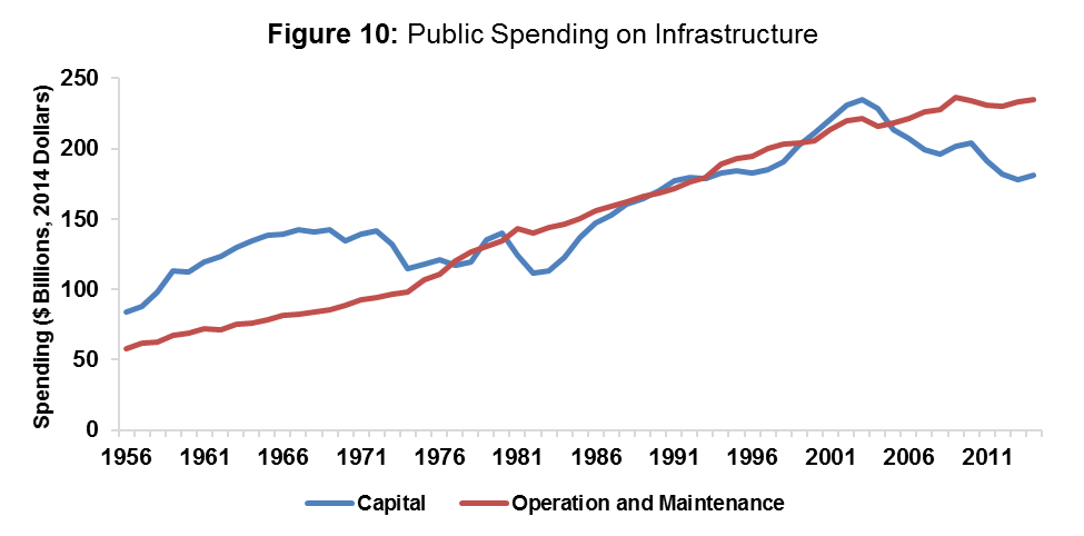
Figure 10 uses CBO data[9] to show that the reason for spending has drastically changed over the years. Between 1956 and 1977, capital expenditures outpaced operation and maintenance expenditures by a large amount. However, now that the infrastructure networks have been established, a larger portion of infrastructure spending is used on operation and maintenance. The rift began in 2005 and as of 2014, operation and maintenance outspends capital investments by $54.5 billion, or 30 percent.
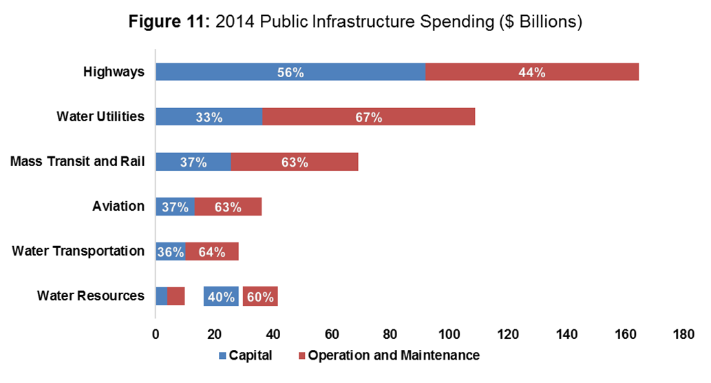
Figure 11 looks at the 2014 purpose of spending by infrastructure type using CBO data.[10] Highway spending demands the largest share of capital expenditure at 56 percent, $91.9 billion. The $91.9 billion spent on highways is more than the capital expenditures for the five other types of infrastructure combined. On the other hand, water utilities require the most operation and maintenance to capital spending with expenditures of $72.5 billion and $36.4 billion, respectively.
Quality of Spending
Another potential reason why today’s infrastructure spending is not perceived to have kept up with historical spending is that the quality of spending has declined. It is very difficult to measure the quality of spending without being able to measure the demand for a type of infrastructure. If resources are being spent on areas with low demand than the quality of spending would be poor.
One potential tool to measure demand is end user fees. For example, a toll can measure the public demand for a road. With that information, actions can be taken to expand the road if there is excess demand, simply maintain the road if there is sufficient demand, or diminish spending on the road if there is no demand.
Conclusion
The declining state of U.S. infrastructure cannot easily be explained by spending cutbacks as overall infrastructure spending levels are comparable to historical trends. The best possible explanations are that public infrastructure needs have changed over the years or that the quality of spending—the impact of spending on the actual improvement of meaningful, usable infrastructure—is worsening.
[1] CBO, “Public Spending on Transportation and Water Infrastructure, 1956 to 2014,” https://www.cbo.gov/publication/49910
[2] Ibid.
[3] U.S. Bureau of Economic Analysis, “Table 5.2.5 Gross and Net Domestic Investment by Major Type,” http://www.bea.gov/iTable/iTable.cfm?ReqID=9&step=1#reqid=9&step=3&isuri=1&903=139
[4]U.S. Bureau of Economic Analysis, “Table 5.4.5. Private Fixed Investment in Structures by Type,” http://www.bea.gov/iTable/iTable.cfm?ReqID=9&step=1#reqid=9&step=3&isuri=1&903=151
[5] Ibid.
[6] Current Employment Statistic, http://www.bls.gov/web/empsit/cesprog.htm
[7] CBO, “Public Spending on Transportation and Water Infrastructure, 1956 to 2014,”
[8] Ibid.
[9] Ibid.
[10] Ibid.