


Research
December 20, 2017
2018 ACA Marketplace Premiums
Executive Summary
This study analyzes the 2018 premium increases for health insurance plans offered on the Affordable Care Act’s individual marketplaces. Specifically, it compares the 2018 premiums to the 2017 premiums by analyzing the cost changes in three different plan types by rating area: benchmark Silver, lowest-cost Bronze, and lowest-cost Gold plans. It finds:
- Benchmark plans from 2017 that are still offered in 2018, even if not as the benchmark, rose by an average of 29 percent—the highest average increase since the ACA began;
- Only 17 percent of all rating areas have the same benchmark plan as 2017;
- The average 2018 benchmark plan premium is 36 percent higher than the average 2017 benchmark plan; and
- The lowest-cost Bronze premium and the lowest-cost Gold premium both increased on average by about by 20 percent.
Introduction
Individuals across the United States are currently examining prices for health insurance plans offered on the Affordable Care Act’s (ACA) individual marketplaces, and they may not like what they find. On top of the challenges insurers face every year in setting their rates—an unbalanced risk pool, heavy regulation, etc.—insurers faced significant uncertainty as they worked to set prices in the runup to this year’s open-enrollment period, especially around speculation that cost-sharing reduction (CSR) payments would be discontinued for 2018—speculation that was recently confirmed. This uncertainty caused many insurers to set 2018 premiums at a high enough level to prevent losses in the absence of CSR payments.
This study evaluates 2018 premiums by comparing them with 2017 premiums. It finds that the cost of 2017 benchmark plans that are still sold in the individual market have increased by an average of 29 percent in 2018 for the 27-year-old non-smoker. Overall, the average 2018 benchmark plan premium is 36 percent higher than the 2017 benchmark plan premium. The average lowest-cost Bronze plan premium is 20 percent higher, and the average lowest-cost Gold plan is 19 percent higher.
Data and Methodology
The primary sources of data for this report are the 2017 and 2018 individual market medical landscape files that are available through the Centers for Medicare and Medicaid Services (CMS).[1] These landscape files contain data on the health insurance plans that were offered through the federally facilitated or federal-state partnership exchanges, which include the same 39 states in both 2017 and 2018.
Health insurance costs vary between regions even within states. To adjust for these variances, the states are divided into geographic rating areas that all insurers must use as a part of their rate-setting process. This study examines premium changes at the level of rating areas, to give greater granularity and precision to the analysis.
The Robert Wood Johnson Foundation (RWJF) also offers exchange data for all states from 2014 through 2018.[2] The RWJF data was used to supplement the CMS data on federal exchanges with data on state exchanges. To fill any gaps in the RWJF data, the study uses plan-comparison tools on state-based exchanges where they are available. Overall, the study analyzes data on 2017 and 2018 Silver plans for 50 states, which account for all rating areas nationwide. The estimates on the number of health insurance issuers in each rating area are also based on Silver plan data.
This study uses plan-comparison tools and rate filings on state-based exchanges to obtain information on 2018 plans not included in the federal data. When computing average price changes across rating areas, this study uses the potentially eligible population in each rating area to calculate a weighted average of the change in each area. The potentially eligible population is defined as the number of individuals who are either uninsured or insured through the individual market, ineligible for Medicaid or the Children’s Health Insurance Program, and determined to be a legal resident. This study estimates this population using the 2011-2013 American Community Survey.[3] All the premium estimates in this report are based on those offered to a 27-year-old non-smoker. Unless otherwise noted, the premium changes do not include any subsidies that are available to middle- to low-income households.
The ACA’s structure eliminates the need, for the purposes of this study, to calculate premium changes for different age groups. The ACA employs an age-based community rating, which limits insurers to charging older, higher-risk enrollees’ premiums of no more than three times as much as younger, lower-risk enrollees. Because of this restriction, age-based rates between 21 and 64 are typically a multiple of the base rate by a factor between one and three. Therefore, there is no real need to consider different ages when determining premium growth as a percentage, because each age is going to see proportional growth. For example, if a 21-year-old’s premium increases by 25 percent, then a 55-year-old’s premium is going to increase by 25 percent also, even though the 55-year-old is being charged more. Under current law, the only way that this could change is if a state adopted a more restrictive age-based community rating than the federally mandated 3:1, which would change the ratio insurers use to calculate rates. The three states that do this for the individual marketplace are New York (1:1), Vermont (1:1), and Massachusetts (2:1).[4]
2018 Benchmark Premiums
A variety of factors, some particular to 2017, could have caused insurance premiums to fluctuate. The major one was the non-payment of CSR payments to insurers for 2018, which would have reimbursed insurers for cost-sharing reductions in Silver plans for certain buyers. Other issues with more indirect effects include the discontinuation of risk corridors and reinsurance for 2017, the health of the pool of insured, and changes in the plans offered. Averages mask a lot of this variation; therefore, it is necessary to look at the national insurance marketplace from various viewpoints to accurately analyze premium changes.
One way to estimate premium growth is to compare benchmark premiums from year to year. The second-lowest cost Silver plan is referred to as the benchmark plan, as federal subsidies are calculated based on this plan. In the discussion of health insurance costs, the benchmark plan is frequently the focus because of its implications for enrollment numbers—roughly 11 percent of the individual market in 2015.[5] Benchmark premiums also have implications for federal spending. As benchmark premiums increase, so do the tax credits provided for those eligible. Therefore, as the benchmark premiums increase, so does federal spending. When 2018 benchmarks are compared with 2017 benchmarks, 2018 benchmark premiums are 36-percent higher on average.
Figure 1. Comparison of 2018 and 2017 Benchmark Premium by Rating Area
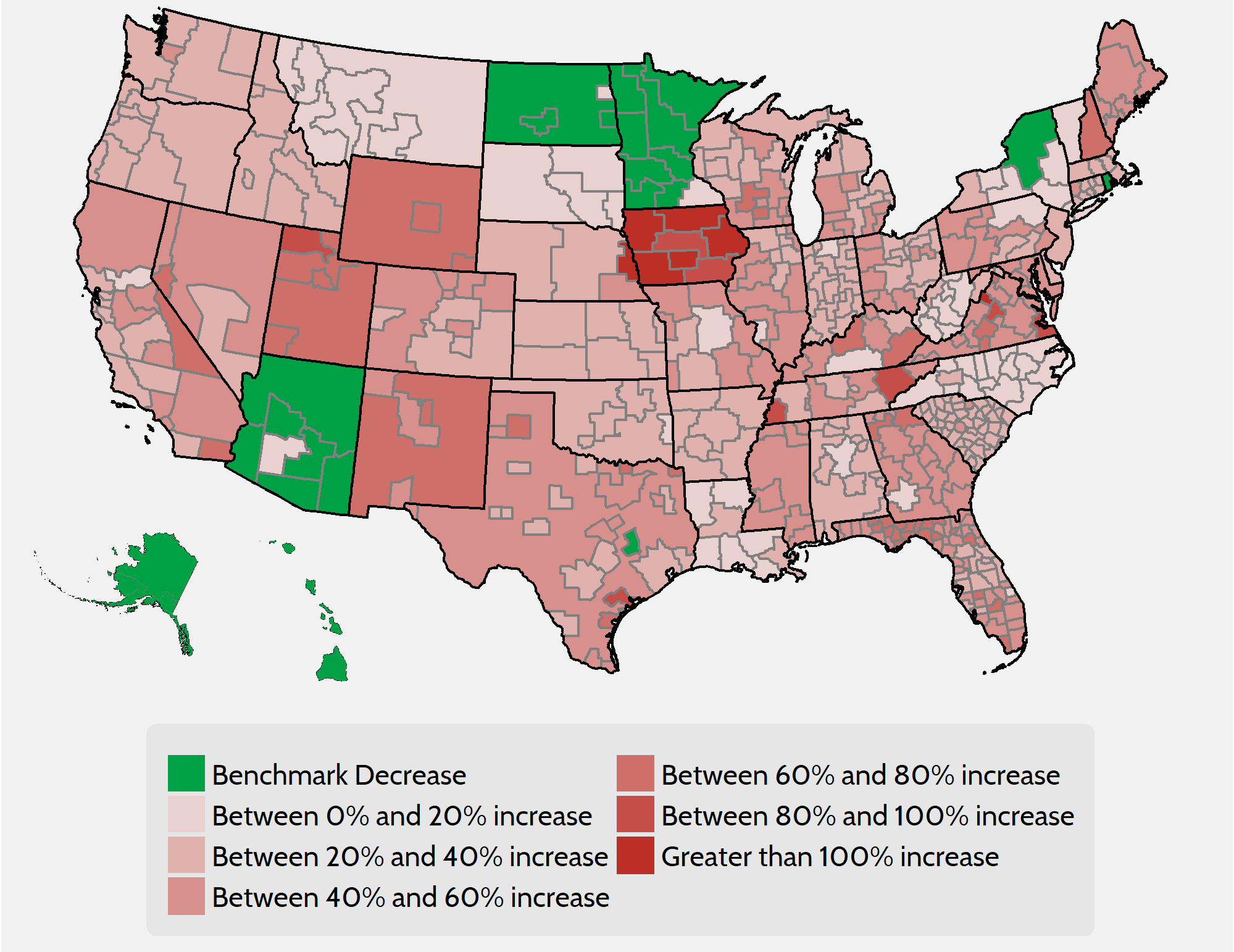
As Figure 1 demonstrates, however, one number cannot accurately summarize the differences in benchmark premiums on a national level. A person in Alaska, Arizona, or Hawaii will likely see a premium decrease, while a person in Iowa signing up for a 2018 benchmark plan will likely see a premium that is more than double the 2017 premium. Changes in benchmark premiums for 2018 range from a 29-percent decrease in certain areas of Arizona to a more-than 150-percent increase for two rating areas in Iowa. Both numbers represent drastic differences from the average national benchmark increase of 36 percent.
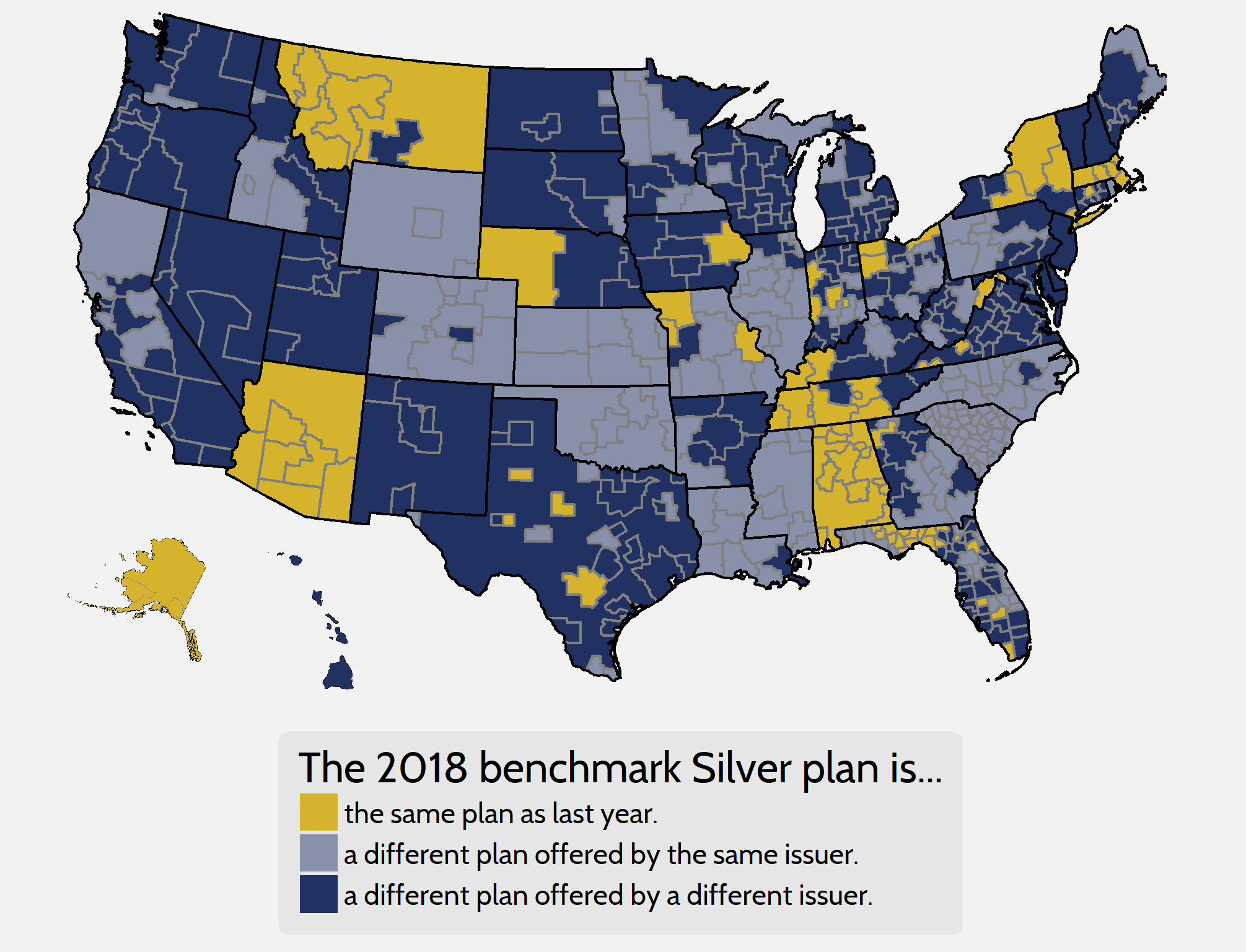
This 36-percent increase in benchmark premiums is not sufficient to measure underlying premium growth on its own, for various reasons. One reason it is deficient is that many rating areas have different benchmarks from year to year. In other words, two different plans are being compared instead of the premium growth for a single, unique bundle of benefits. As shown in Figure 2 below, in 2018 only 17 percent of rating areas feature the same benchmark plan as the 2017 plan year, and only 68 percent of 2017 benchmarks are offered on the exchanges this year. The premiums for 2017 benchmark plans that are still offered on exchanges in 2018, even if not as the benchmark for the new year, have increased by 29 percent, on average.
Figure 2. Benchmark Churn from 2017 to 2018
The uncertainty during the 2018 rate-setting process makes this comparison even more deficient than usual. Bracing for the absence of CSR payments, many insurers disproportionately raised premiums for benchmark plans to help pay for the extra benefits they are legally required to provide to eligible consumers. If the federal government decides to reintroduce CSR payments for plan year 2019, however, it is possible that benchmark premiums could decrease on average for that year. This distortion in benchmark plan pricing means that examining premium increases for plans in other metal levels will provide a useful and potentially more accurate portrait of actual underlying premium growth.
Looking at Gold and Bronze Premiums
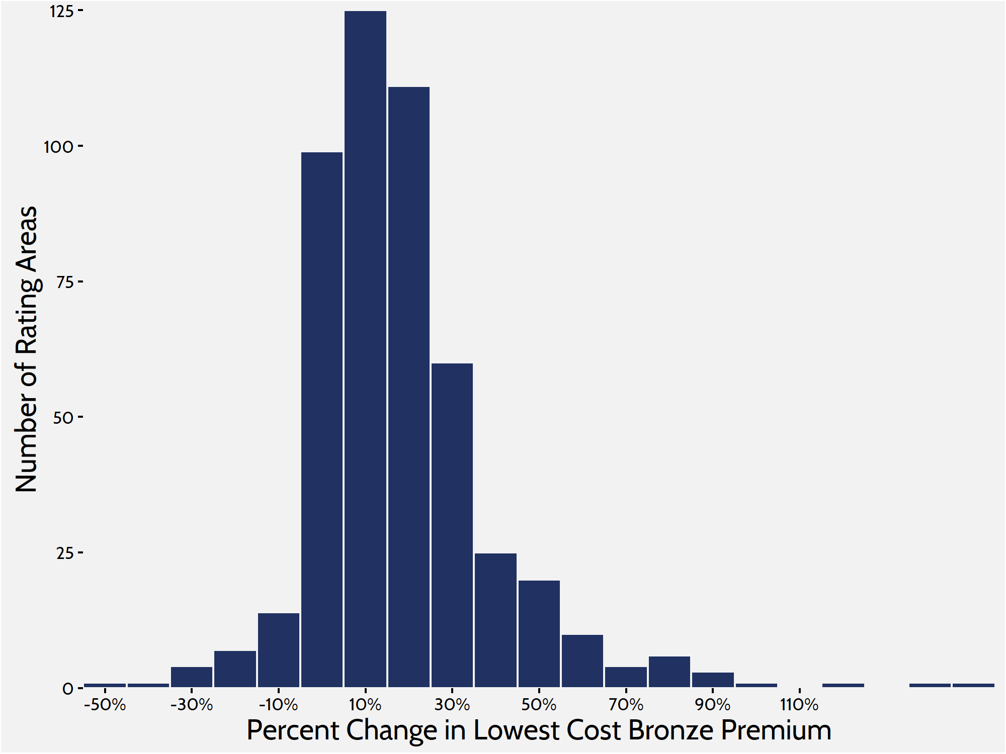
To get a more complete picture of what is happening in the individual marketplace, it is helpful to look at Bronze and, this year, Gold plans. Silver plans enrolled roughly 71 percent of the marketplace in 2017, while Bronze plans—the cheapest metal level on the market—enrolled about 22 percent.[6] This report looks at the lowest-cost Bronze plan in each rating area to get another frame of reference on premium changes. Comparing these lower-cost plans gives us a better understanding of how people are affected throughout the market, because lower-cost plans are more likely to attract those ineligible for subsidies and cost sharing. When weighted by population, premiums for the lowest-cost Bronze plan have increased by 20 percent between 2017 and 2018.
Figure 3. Lowest-Cost Bronze Premium Increases
 Gold premiums saw similar growth. The average lowest-cost Gold plan in each rating area is set to increase by an average of 19 percent for plan year 2018. Historically, a much smaller share of consumers enrolls in Gold plans than in Silver or Bronze plans. Roughly 4 percent of individual market consumers enrolled in a Gold plan in 2017, and similar numbers purchased Gold plans in the previous years.
It is helpful to include Gold plans in this analysis, however, because of the exceptional circumstances leading to the large increase in benchmark premiums. One peculiarity created by the large increase in benchmark premiums is that there are many areas where Gold plans are cheaper than the benchmark. Of the 501 rating areas, 120 rating areas feature at least one Gold plan that costs less than the benchmark Silver plan, and because of the increased benchmark premiums, it is possible that Gold plans will see a bump in enrollment. Under current law, households between 300 and 400 percent of the Federal Poverty Level are entitled to subsidies if the benchmark premium is more than roughly 9 percent of their annual income. Because of the spike in benchmark premiums, it is likely that many people in this income range will enroll in Gold plans because of those plans’ smaller cost sharing—in other words, these consumers can buy higher-quality products at a cheaper price.
Figure 4. Lowest Gold Premiums compared with Benchmarks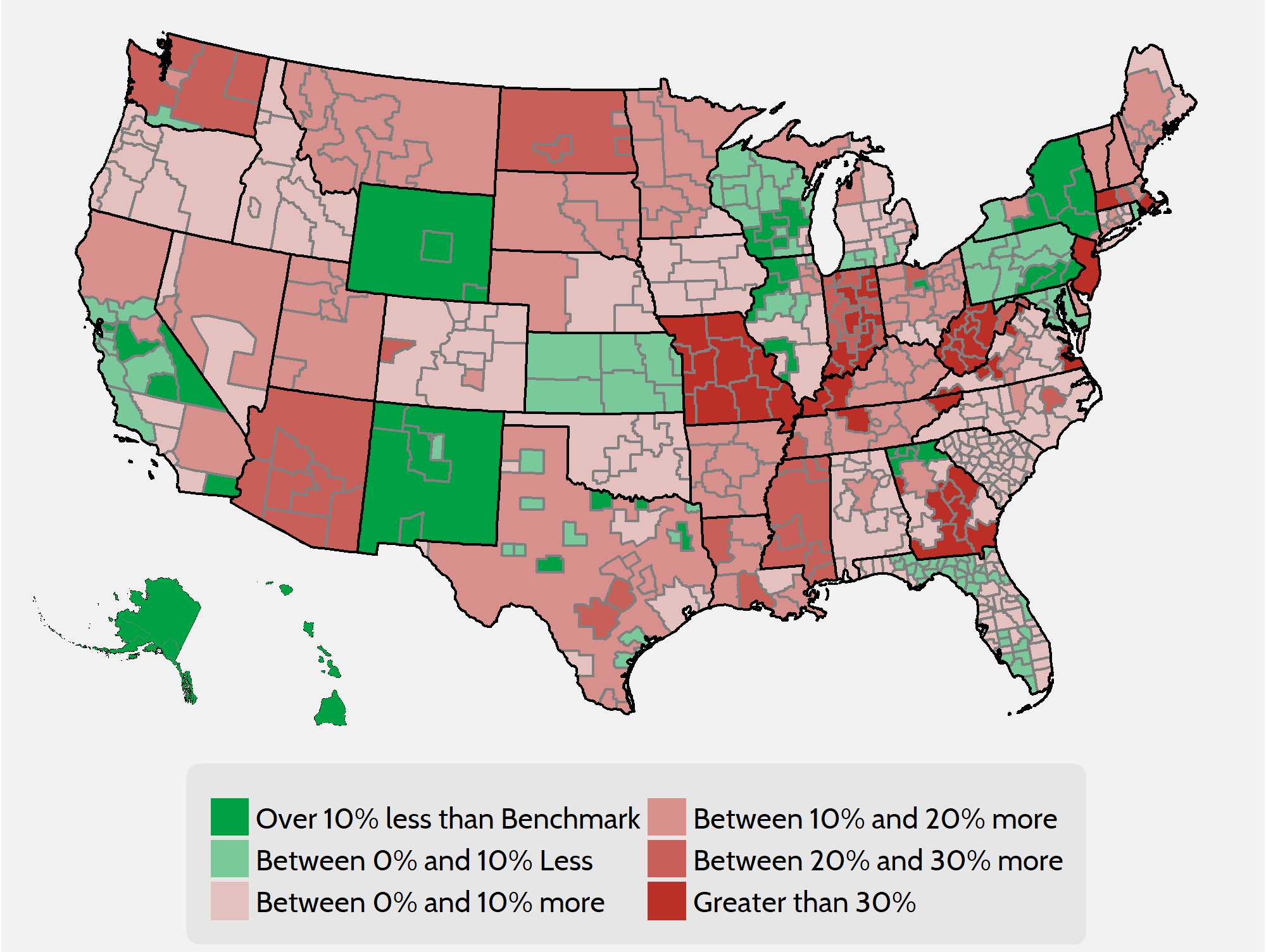
As can be seen from Table 1, the lowest-cost Bronze and Gold plans increased at significantly lower rates than the benchmark plan. Even though Gold and Bronze premiums had relatively modest increases, it is probable that the same uncertainty that affected benchmark premiums had a similar effect on plans in the other metal levels. Again, if CSR payments are reintroduced for the 2019 plan year and insurers are given enough time to set rates accordingly, it is possible that premium increases will be much less for the Gold and Bronze levels in 2019 in addition to probable decreases to Benchmark premiums.
Table 1. Premium Increase Quartiles by Metal Level
| Metal Level |
Minimum |
25th Percentile | 50th Percentile | 75th Percentile |
Maximum |
| Lowest Bronze |
-53% |
5% | 14% | 26% |
134% |
| Benchmark Silver |
-27% |
23% | 34% | 48% |
159% |
| Lowest Gold |
-42% |
7% | 13% | 24% |
153% |
Insurer Competition
Other federal health care programs designed around subsidized private insurance—such as Medicare Advantage and Medicare Part D—show that competition among insurance companies is an important means of controlling prices. In the ACA individual market’s first year of open enrollment, research showed that a lack of competition was correlated with higher premiums and $1.7 billion in higher subsidy spending.[7] Now in the fifth year, amidst the uncertainty of 2017, insurers are continuing to drop out of the individual marketplace. This increasing lack of competition continues to impact premiums and plan offerings.
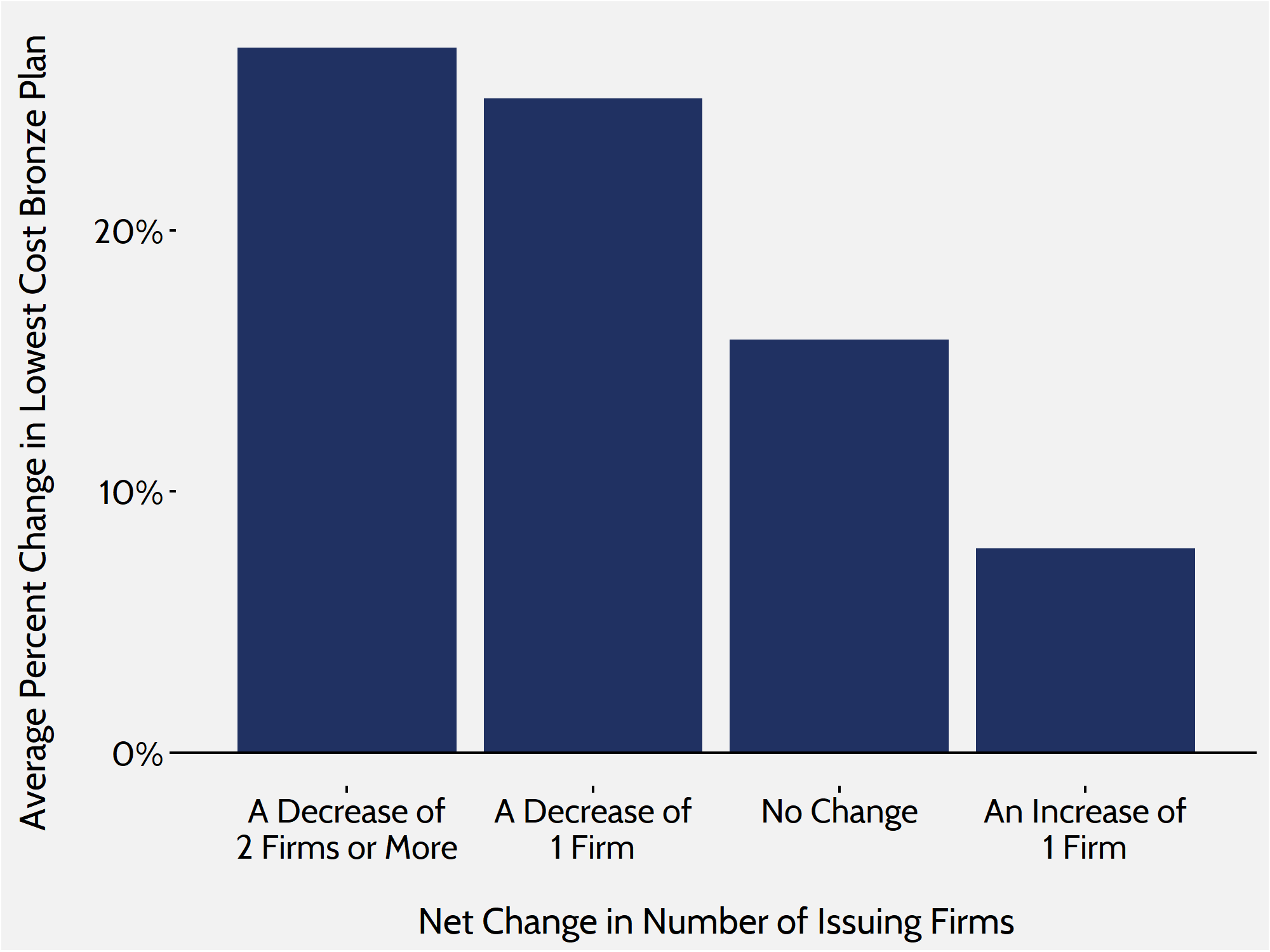
As in previous research, this study finds that increased competition in the marketplace leads to smaller increases in premiums. In rating areas where competition increased, the average lowest-cost Bronze premium increased by roughly 8 percent. In areas where competition stayed the same or decreased, that premium increased 20 percent. As shown in Figure 6 below, the average premium increase in lowest-cost Bronze plans was well over 20 percent for rating areas that saw a decrease in competition.
Figure 6. Bronze Premium Changes and Issuer Fluctuation
 In 2018, the number of rating areas losing insurers again outpaced those gaining insurers. Only 23 out of 501 rating areas will see an increase in competition, while 169 rating areas lost at least one insurer. Of the rating areas that lost insurers, 72 rating areas lost two or more, and many regions in Idaho, New York, Iowa, and Massachusetts, among others, saw three or more insurers exit their exchanges.
Conclusion
Though not all rating areas or states saw significant premium increases in 2018, the individual marketplace as a whole will see its highest average premium increases since its inception in 2014. While the ACA’s subsidies will shield many consumers from these price increases, consumers who are seeking insurance on ACA marketplaces but are ineligible for tax credits will feel the full cost of these increases.
Funding CSR payments for 2019 might add a good deal of stability to the marketplace, and Congress could easily mitigate these increases in the short term by appropriating funding for CSR payments. However, the CSR payment uncertainty merely disguises the more fundamental problems with the ACA that still need to be resolved. Prior to 2018 open enrollment, the individual market suffered from an unbalanced risk pool, straining regulations, stagnant enrollment, and a lack of competition—each of which led to substantial premium increases in 2017. Until these issues are adequately addressed, premiums will likely continue to rise—as will federal spending.
[1] Individual market medical landscape files are available for download at data.healthcare.gov
[2] Robert Wood Johnson Foundation, “HIX Compare 2015-2016,” available at: http://www.rwjf.org/en/library/research/2015/12/hix-compare-2015-2016-datasets.html
[3] https://www.census.gov/programs-surveys/acs/
[4] Market Rating Reforms. Centers for Medicare and Medicaid Services (CMS), Department of Health and Human Services (HHS), March 15, 2017. Accessed at: https://www.cms.gov/CCIIO/Programs-and-Initiatives/Health-Insurance-Market-Reforms/state-rating.html
[5] https://www.cms.gov/Newsroom/MediaReleaseDatabase/Fact-sheets/2015-Fact-sheets-items/2015-10-26-2.html
[6] 2017 Marketplace Open Enrollment Period Public Use Files. Centers for Medicare and Medicaid Services (CMS), Department of Health and Human Services (HHS), March 15, 2017. Accessed at: https://www.cms.gov/Research-Statistics-Data-and-Systems/Statistics-Trends-and-Reports/Marketplace-Products/Plan_Selection_ZIP.html
[7] Gruber J, Dafny L, and Ody C, “More Insurers Lower Premiums: Evidence from Initial Pricing in the Health Insurance Marketplaces,” NBER Working Paper No. 20140, May 2014, available at: http://www.nber.org/papers/w20140